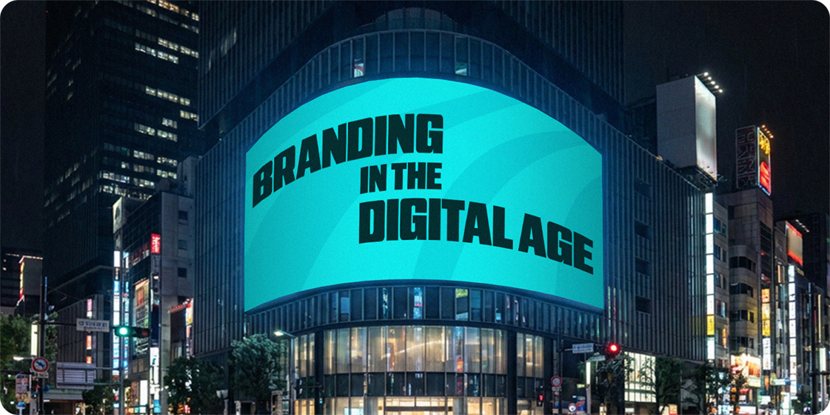
Branding in the Digital Age
The fundamentals of branding haven’t changed in the past 50 years. Clarity, consistency, and distinctiveness remain essential for building a strong brand. What has evolved, though, is the way these qualities are expressed.
We now live in a world where a brand needs to perform everywhere from smartwatch screens to billboards, social feeds to packaging, animations to print. This shift has challenged marketers and designers to think in a whole new way about what it means to build a consistent, coherent brand identity.
Modern brand identities aren’t static. They’re designed to move and scale, adapting seamlessly across both digital and physical spaces. This article offers guidance on approaching branding projects in a way that keeps pace with the demands of the digital age.
The digital shift
Today, brands exist simultaneously across countless touch-points. A logo might appear in a website header, an app icon, a social post and an animated billboard which are all seen within the same campaign. Therefore, balancing consistency with the need for flexibility has become essential.
Digital experiences are now as important as static design - sometimes even more so. Audiences increasingly engage with movement, interaction and story-led content, and research shows interactive experiences generate over 50% higher engagement than static visuals (Outgrow, Insivia). There’s a growing appetite, and maybe even an expectation, for dynamic content, which means brands must perform in motion as well as static.
This is the essence of digital-first thinking: designing with digital environments as the foundation, then translating those principles into print and physical applications. It doesn’t mean ignoring traditional media. It means recognising that most audiences will now encounter your brand first, and most frequently, on a screen.
Marketing and brand teams that adopt this mindset create brands that are consistent, memorable, and, ultimately, easier to implement. The best work happens when everyone understands that digital consistency and user experience are just as critical as visual appeal, and that the two should go hand-in-hand.
Design considerations for a digital-first world
As the digital landscape evolves, brands (and the teams behind them) are expected to evolve too. Today’s design considerations go far beyond colours and logos.
Colour
Digital branding demands more versatile colour systems than ever before. In print, a handful of CMYK and/or Pantone swatches might be all you need, but online a brand needs a palette robust enough to handle accessibility, contrast, light and dark modes, and interactive or animated content.
Best practice starts with a core palette – the colours that form the backbone of a brand identity and build recognition. Beyond that, an extended palette provides variety where necessary and supports more functional colour use in digital spaces: buttons, charts, call-to-actions and campaign graphics.
The below example shows how Skoda categorise their colours.
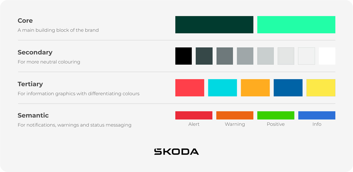
Colour also plays a crucial role in accessibility. Every combination should meet recognised contrast standards (WCAG), ensuring legibility for every user. Using digital tools such as colour tokens helps maintain consistency across websites, apps and campaign assets.
In a digital environment, colour is more than just an aesthetic choice. It’s a crucial part of the user experience, guiding navigation, enhancing clarity, and reinforcing the brand across every touchpoint.
Typography
Typography remains one of the most expressive elements of any brand, shaping personality and tone of voice. In the digital world, it takes on an even more dynamic role, as type needs to respond to multiple screen sizes and layouts whilst maintaining clarity and impact.
This is where type scales come in. These are proportional systems that ensure headings, subheadings and body text stay consistent and legible across devices. Effective digital typography prioritises hierarchy, readability and adaptability.
The Whitney Museum’s identity is a great, simple example: bold and structured, yet completely flexible, it retains its essence and impact whether seen on a giant screen or a mobile device.
Consistent typography builds familiarity, but flexible systems ensure that messaging always feels intentional and is fit for purpose.
Iconography and micro-branding
Icons have become a core part of a brand’s voice. A well-designed icon can guide users to where they want to go and communicate information quickly and efficiently.
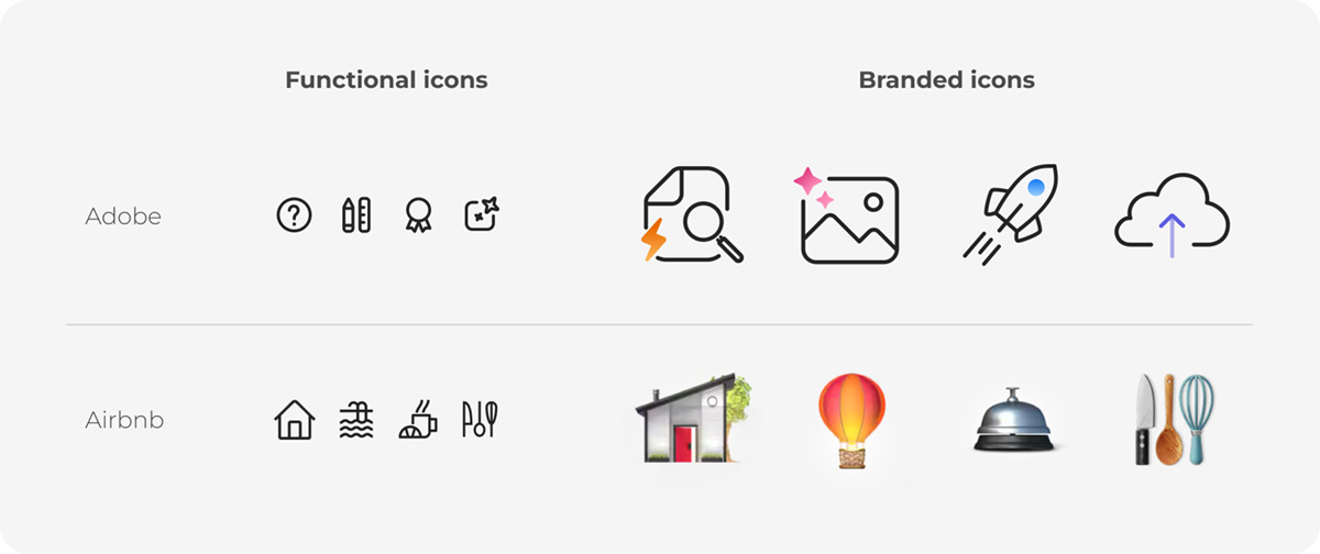
Functional icons, used for navigation or interfaces, should be simple and universally understood. Libraries such as Google’s Material Icons are strong foundations to build from.
By contrast, branded icons can express more personality and communicate more about a brand itself. They often appear in marketing or storytelling contexts and can carry a unique tone. Airbnb’s characterful icons are a charming example of how powerful these can be.
For marketing teams, the key is understanding the icon’s purpose: functional icons for usability (when clear communication is key) versus expressive icons for brand-building (when a personality can shine). There can be somewhat of a sliding scale, where more and more personality is injected into icons as their prominence grows.
At small sizes, clarity always wins. Icons should be designed on a pixel grid, typically at standard increments such as 16px, 24px or 32px. At larger sizes (64px and above), they begin to act more like illustrations, where creative flair can shine through.
Practical takeaways for marketing and brand teams
Creating a brand that performs beautifully across every platform may sound complex, but the foundations are fairly straightforward – it’s about designing for responsiveness, accessibility and adaptability. Keeping the following principles at the front of your mind throughout the brand creation process will help ensure your brand is truly digital-first.
Think responsively
Brand guidelines shouldn’t lock a brand into rigid rules; they should provide systems that allow flexibility and enable the brand to adapt to every touch-points. Consider how your identity behaves in motion, scales to small screens and adapts to new channels. You don’t want to have designed the perfect logo, only to find out it’s completely illegible when uploaded as an Instagram profile picture.
Make accessibility a priority
Accessible design is no longer a ‘nice-to-have’. It’s both a legal expectation (ADA in the United States and the EU accessibility act in Europe) and a mark of credibility. High-contrast colours, legible fonts and clear hierarchy benefit everyone, not just those with accessibility needs, and ultimately opens up your brand to a wider audience. Great tools like WAVE and WebAIM exist to make this process easier for marketers and designers.
Build adaptable assets
Logos, icons and typography should scale seamlessly between print and digital. Platforms like Figma allow brand teams to test and adapt assets in real time, ensuring they hold up wherever they appear.
Use print strategically
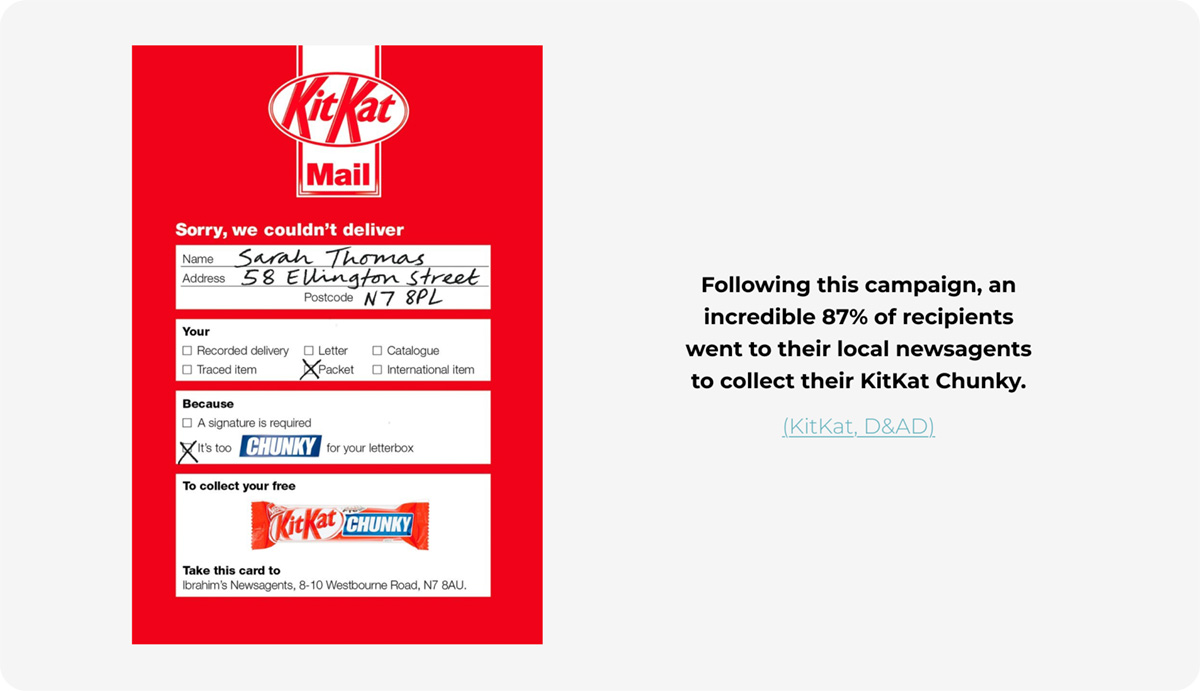
Print still holds significant power. In a digital-first world, tangible materials can feel more premium and memorable. The Direct Marketing Association found that direct mail achieves a 4.4% response rate compared to just 0.12% for emails, so the potential value of print is obvious. Print does, of course, come at a greater cost, so the key is recognising when an investment in printed materials is going to provide a return on the investment, and when digital is most appropriate. It’s also crucial that any printed materials work together with digital output to form a coherent brand experience for its audiences.
Closing thought
In the digital age, the strength of a brand lies not in how good the brand looks in isolation, but in how confidently and coherently it performs across every channel. The most successful identities are those that flex, respond and feel alive, equally at home on a mobile screen, a website or a printed page. For brands today, the challenge isn’t specifically how to design for digital – it’s how to design for everything, and make it all work together.
Last updated January 2026
