The Importance of Website Navigation
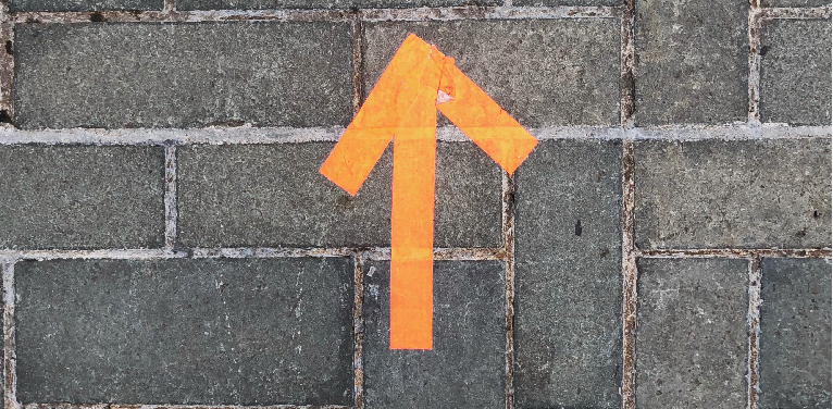
Imagine giving directions to someone; they need to be clear and concise or else they might get lost. And clear and concise is exactly what your website menu should be like.
Does this really matter? Yes, it does. For a start, when people are on your website, they need to know how to get to what matters to them, as quickly as possible. And descriptive page titles also affect search engine optimisation, how high your page ranks and, consequently, the amount of traffic you’ll get from a search.
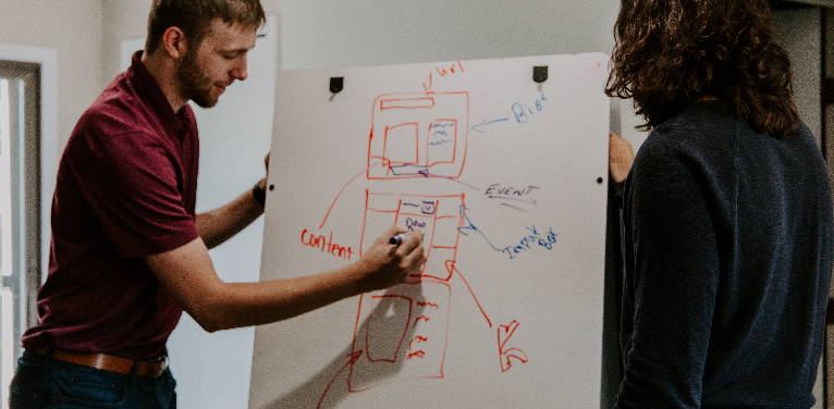
Little things make a big difference. Your website structure and navigation naming make a big difference to how your visitors arrive and use your site. To help you assess your website menu, here’s some things to look at.
1. Meaningful and relevant content
Decide who your site is for, then decide what pages are important for them. A website needs to be designed for the needs of the people who will use it. As such, the content or features that are important to them are what the website should focus on.
A link like “Message from the CEO” may be important to your company’s head honcho, but if your customers are not looking for that content, then placing it in the top navigation menu may take the space of a link that is important to your customers!
2. Seven (or fewer) menu items
There are some limits on our capacity for processing information and the magical number is seven, plus or minus two, see George Miller 1956.
Applying this works well for your main navigation, for two reasons, search engines and visitors.
Search engines: A search engine gives your home page its overall ‘authority’ because more sites link to your homepage than to your interior pages. As this authority flows down to your interior pages via your navigation, it dilutes, thus reducing these pages ranking. Having fewer pages will result in the higher ranking of your actual pages. Less is more as far as SEO is concerned.
Visitors: Even more importantly with a person’s short-term memory holding only seven items, plus or minus two, less is definitely more. With the brain using “chunking” as a method to improve recall in short-term memory, having five to seven main sections is key to a good navigation structure.
If you need to use more than seven items, consider breaking them up into groups, avoiding long lists.
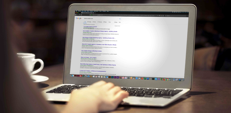
Need to know now many pages Google has indexed on your site?
Open Google search and enter the below search query by replacing the site name with yours:
site:sitename.com
You’ll see the results like below with the number of indexed pages in Google. Though this may not be the actual count of webpages on a site, it gives an idea of number of indexed pages on Google.
3. Short, sweet and relevant

Once you’ve got your website navigation whittled down to around five main menu items, it’s important make sure your page menu titles are short, sweet and relevant for your users and SEO purposes.
A link that says “All About Our Company” is unnecessary when just “Our Company”, “Company”, “About Us”, or “About” will work just fine. This may not seem like a big edit, but we have gone from four words to just one or two.
By editing your navigation menu, your site will be easier to read, improving the user experience, and your users will be more likely to find and click on relevant content.
Also, for SEO purposes, According to Backlinko, “Shorter URLs tend to rank better than long URLs.”
So, take the time to look at your page menu titles from the view point of your users.
4. Website navigation order

The number of menu items matters, but so does the order of those items.
In website navigation, just like any list, items at the beginning and the end are most effective, because this is where attention and retention are highest. It’s called the serial position effect.
Primacy effect: Items at the beginning of a list are more easily remembered. Recency effect: Items at the end of a list (or things that just happened) are more easily remembered.
It then follows that anything we put at the beginning or end of our navigation becomes more prominent. Place items that are most important to your business and your visitors in these places.
5. Multi-device friendly
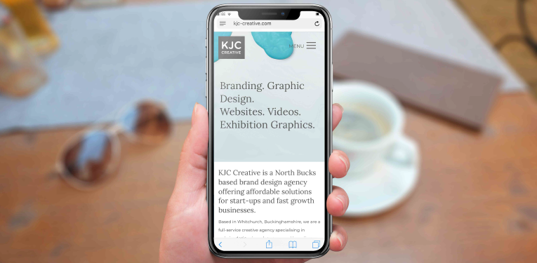
How device friendly is your website? In the UK, tablet and mobile use has just overtaken desktop according to Stat Counter, so you need to make sure your website works equally well on a smart phone as well as on a laptop.
With people now used to scrolling down a page on a smart phone, your homepage can also act as a type of navigation menu, with links to all of your main pages. Burger menus and dropdown items should be tested to make sure that they are easy and usable, as there are minimum sizes for menu items that need to be clicked on for touch screens, and if usability is important to you (of course it is!), it’s also good to write the word ‘menu’ when using the burger menu.
Our advice is to test, test and test on as many devices you can.
6. Link your logo back to the home page
This might seem obvious, however it’s not uncommon to find sites that fail to implement this function.
The common convention for logo placement is the top left-hand corner or centred along the top and the logo is also known as a link back to the homepage. This is a convention that is best followed as it is so widely implemented.
7. Utilise your footers

Footer space at the bottom of your website used to be reserved for privacy and legal links, however it has now become an important piece of real estate.
Footer SEO best practice says use your footer for links to your site’s legal pages, contact pages, email signup forms, your sitemap, social links and your latest posts, making sure all external links have a “no follow” tag (yes, your social links are external links and should have this tag).
The footer can also work as a design element to frame your layout and give a definite end to the page, so it makes sense to include it as part of your navigation strategy.
Final thoughts
The design of your website’s navigation can make or break the experience for your customer. By ensuring your website’s navigational structure is clear and easy-to-use, you will encourage your visitors to spend some time on your site and help direct them to the content or features that are important to them and important to your business.
Not sure if you need to make a change? Then drop us a line and we’ll happily review your site free of charge.
